Redesigning Pawn Retail from the Ground Up
EZCORP
Role
Lead UX designer across all three workstreams, from discovery through hi-fi design, working directly with senior stakeholders, compliance, legal, and engineering.
I worked as a consultant with Ensono agency.
Platform
Desktop and mobile platform
Duration
June 2025 - April 2026
Context
EZCorp, runs over 800 pawn and lending stores across the US and Mexico. Every one of those stores relied on a point-of-sale system that had been built up over years. It worked, but it wasn't built with the people using it in mind: pawnbrokers, store managers, compliance teams.
EZCorp made the call to rewrite the entire system from the ground up — a full platform migration, not a refresh.
New teams formed specifically for this rewrite, working together for the first time — some people in roles they hadn't held before.
Prioritisation
I worked closely with a Business Analyst to help the business figure out what to design first. We ran a series of workshops to map out every workstream, understand dependencies, and prioritise based on risk, regulatory exposure, and operational impact. That prioritisation exercise shaped the roadmap for the rest of the project and surfaced the three workstreams that became the core of my work.
The three projects:
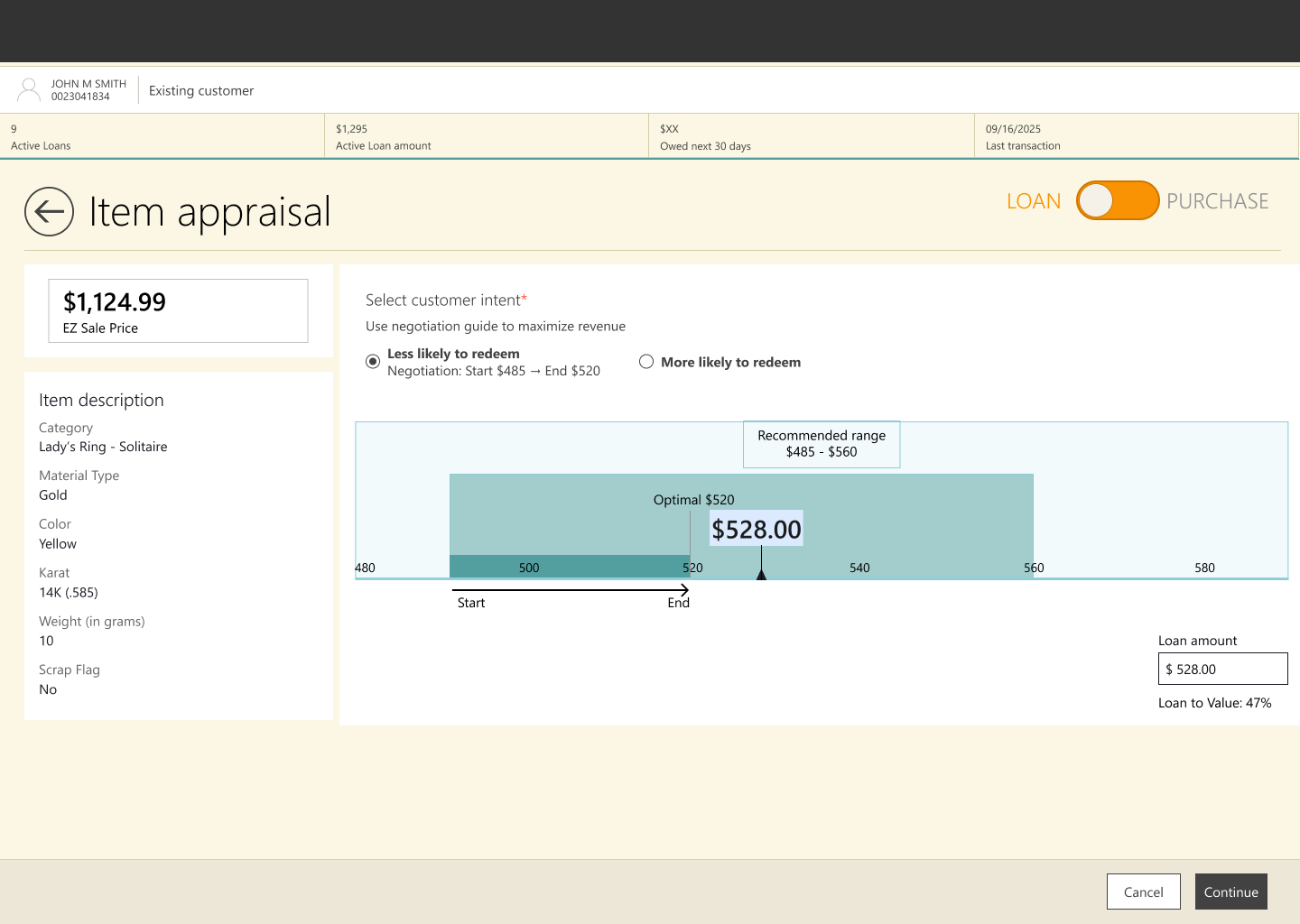
Pricing & Lending Guidance - Making an opaque pricing engine a guided and trustworthy experience
Mobile Item Manager - Bringing inventory management from paper and desktop onto the shop floor
Digital Receipts - Turning physical receipts into a modern, compliant customer experience
Pricing & Lending Guidance
…to give store staff better pricing transparency, structured lending guidance, and smarter approval workflows.
Stakeholder workshops to understand requirements
…
User feedback on intial concepts
The user researcher conducted 60 user interviews and 2 surveys and we identified key needs.
End users (Analysts, Policymakers, Cabinet Office):
Needed better search and navigation
Wanted to see multiple data types together
Struggled with information overload
Adminsusers (Analysts uploading data):
Publishing was slow, complex, and unreliable
Downloadable assets were hard to extract and format for reports
System instability made updates risky
Restructuring content
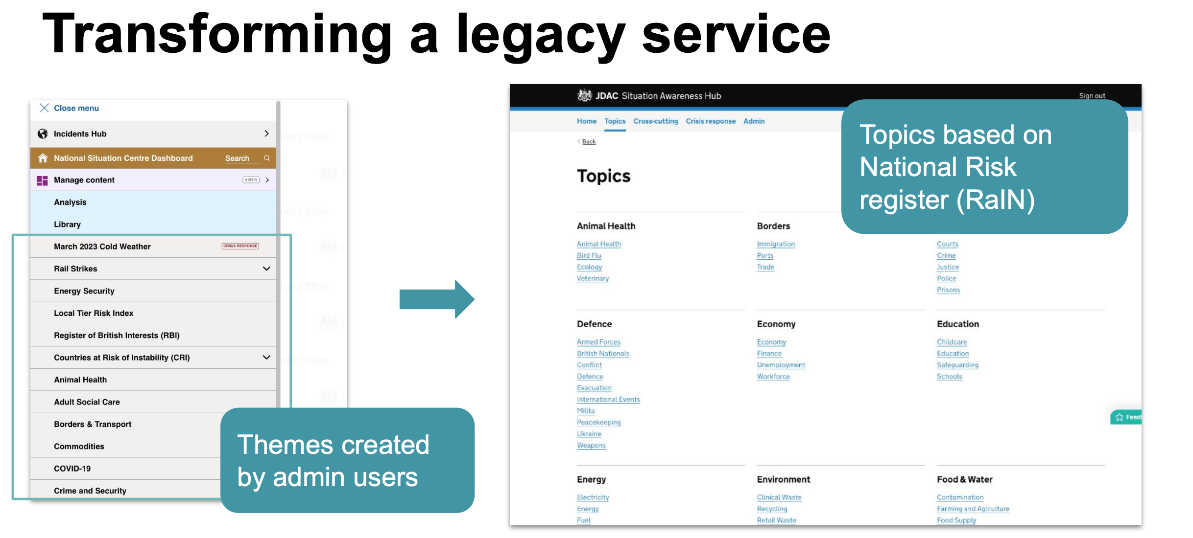
I designed a new navigation and content structure to improve browsing and searching. Content was reorganised to be based on the National Risk register.
Creating journey maps, wireframes and interactive prototypes
Using Figma, I designed user journeys and wireframes for both content consumers and admins, utilising the GDS design system.
Creating interactive prototypes for testing the process journeys as well as identifying all of the states within the flows.
I learned that linking designs to Jira tickets helped the team with project management
Each design phase involved iterative testing to ensure our design decisions were evidence-based.



New ways to navigate and search
I introduced multi-layer navigation patterns to satisfy depth of research whilst retaining user orientation.
Topics were associated with tags to enable content to sit in multiple places to increase discoverability


We explored and user tested different navigation patterns. The tabbed submenu performed better as users were able to see the topics without scrolling down, which was a problem especially on mobile.


Crisis management was an important section for the organisation that was previously hidden within the legacy system menu as a label. I redesigned the architecture to have it as its own topic in the main menu and tag to so crisis respond users could access relevant information straight away during a crisis.

Users wanted to view different content types together and I explored and user tested checkboxes verses second layer of tabs at the top. tested better with users and it didn’t compromise on space for viewing charts.

Admin journeys - Iteratively testing and designing
We regularly tested admin journeys with admin users to refine the designs and found that we were constantly learning about their workflow and requirements
Added a filter to help admin users find and update charts
Concept tested 3 filter designs which varied in how the topics were grouped


Designed for web (primarily used), tablet and mobile users

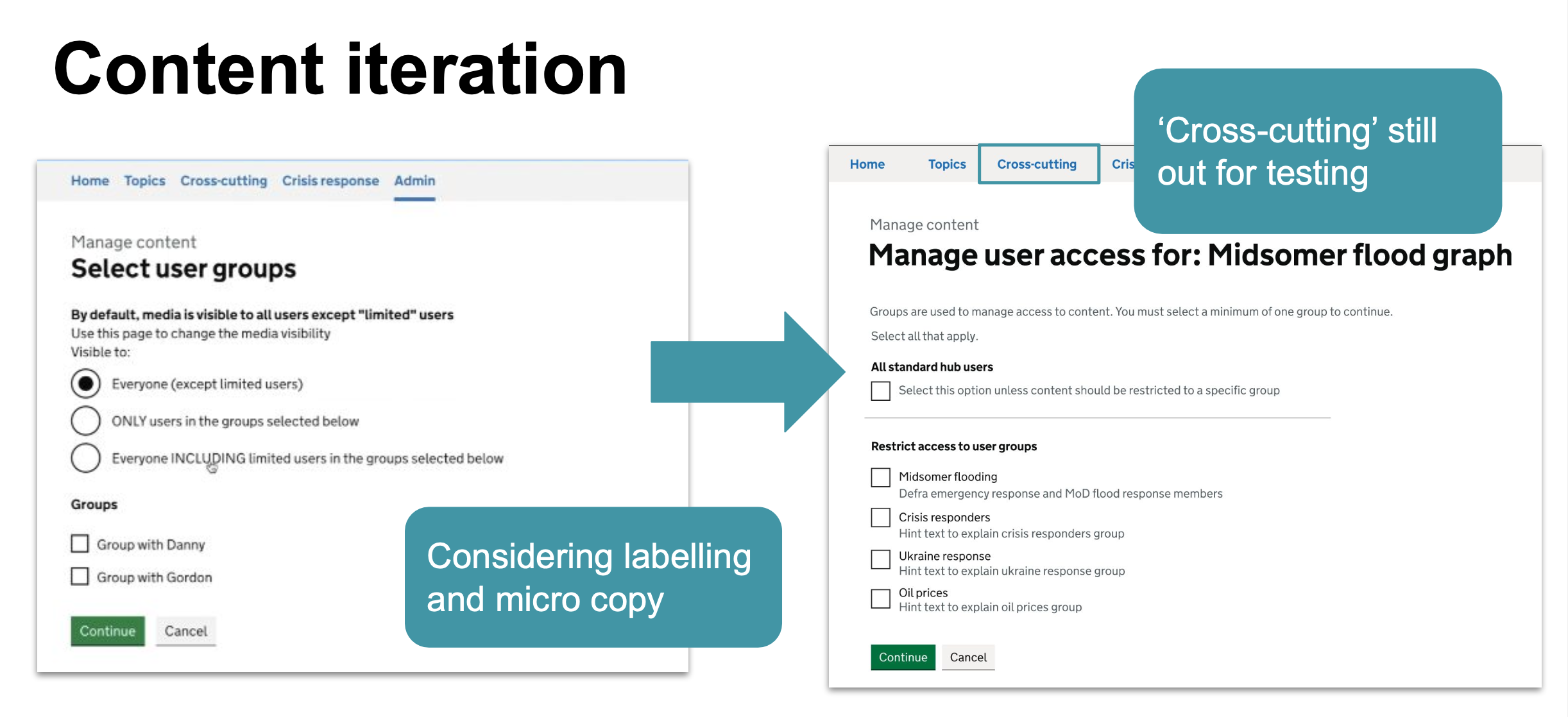
Design improvement through content iteration and GDS design critiques
I learned from a content designer to refine areas of the journey which presented confusing options for users
I partook in design crits with other designers in Cabinet Office digital which provided helpful considerations


The project passed GDS assessment.